If you're getting Google Ads clicks but no leads, start by checking whether real inquiries are being recorded, whether the clicks come from people who need your service, and whether your landing page makes it easy to contact you. Spending more won't repair a broken form or make an irrelevant search more valuable.
This guide focuses on lead generation through Google Search campaigns, especially for service businesses. Other campaign types have different reporting and targeting controls, although the checks on your website and lead handling still apply.
First, work out what “no leads” actually means
Before changing your ads, compare the campaign report with what is happening in your business. Look at form submissions, your customer management system, email inquiries, and call records for the same period.
Are there genuinely no inquiries? Are inquiries arriving but missing from Google Ads? Or does the dashboard show conversions while your sales team says none of them are useful?
Those are different problems. A conversion is an action you've configured the system to measure. It isn't automatically a qualified potential customer. For example, tracking a click on a phone number tells you someone tapped the link, not that you had a conversation about a job. Google documents how button and link clicks can be tracked as conversions.
What you see
What to check first
Real inquiries arrive, but Google Ads reports none
Conversion tracking and how inquiries are attributed to the campaign
Google Ads reports conversions, but there are no matching inquiries
Which actions are counted, duplicate tracking, and form delivery
Neither the business nor Google Ads records leads
The contact process, search intent, and landing page
Inquiries arrive, but most aren't suitable
Search terms, location settings, offer clarity, and lead qualification
These are starting points, not diagnoses. More than one issue can exist at the same time. The point is to stop treating every disappointing report as a reason to buy more traffic.
Test the whole inquiry process yourself
Open the exact destination URL used by the ad, preferably on your phone first. You don't need to click your own live ad to do this. Read the page as someone who has never heard of your company, then complete the contact process.
Don't stop when a success message appears. Follow the inquiry all the way to the person who is supposed to receive it.
Submit a clearly labeled test inquiry using realistic information.
Check that required fields, validation messages, and any spam protection work on mobile.
Confirm the submission is stored or delivered to the correct inbox or customer management system.
Check the customer's confirmation message and any promised follow-up email.
Test the displayed phone number and confirm it reaches the right person or voicemail.
Tell your team it's a test, and exclude test inquiries from your performance review. Have whoever manages tracking separately validate the conversion event using the appropriate testing tools. A direct visit can confirm that an event fires; it doesn't prove that a real ad click will be attributed correctly.
A form can appear to work while its notifications go to an old email address. A booking tool can load on desktop but be awkward to use on a small screen. These are possibilities to test, not assumptions to make about your website.
If you find a broken contact route, fix it before sending more people through it. Ongoing website management should include checking the functions your business relies on, not simply confirming that the homepage loads.
Look at what people searched for, not just your keywords
A keyword is part of your campaign setup. A search term is what someone actually typed. Reviewing only your keyword list can miss an important reason your clicks aren't turning into inquiries.
Imagine a local company advertising installation of new garage doors. Someone searching for “garage door installation near me” may be a good fit. Someone looking for “garage door installer jobs” wants something very different, even though the words overlap.
Use the Google Ads search terms report to examine the queries associated with your traffic. It isn't a complete list of every search: Google omits some low-activity queries to protect privacy. Still, the available terms can reveal mismatches between what people want and what you sell.
Look for patterns in the spend as well as individual phrases. Are you paying for job seekers, do-it-yourself instructions, services you don't offer, or products you don't stock? Don't automatically exclude research-oriented searches; some buyers need to understand their options before contacting anyone. Ask whether the campaign and page are equipped to help that type of visitor.
When a query is clearly irrelevant, a negative keyword may help prevent similar unwanted traffic. Choose its scope carefully. Google's guidance on using search terms to find negative keywords explains that negative match types work differently from positive keywords. Blocking a broad word without thinking through the consequences can also block customers you want.
This isn't a reason to replace every keyword with exact match or abandon a bidding strategy overnight. Make changes that address an observed problem, then review what happens.
Check who your location settings can reach
Choosing a city doesn't necessarily mean your campaign only reaches people physically there. Google's default location option includes people in or regularly in your target area, as well as people who have shown interest in it.
If you only want inquiries from people in your service area, review whether “Presence” better fits the campaign. But that isn't a universal fix: a person arranging services before moving to your city might be a perfectly good customer. Google explains the distinction in its advanced location options. Location detection also isn't perfectly accurate, so compare the settings with the actual locations of your inquiries.
Make sure the page delivers what the ad promised
Think about the expectation your ad creates. If it offers a bathroom remodeling estimate, does the destination page immediately explain your bathroom remodeling service and how to request that estimate? Or does it drop the visitor onto a general homepage and leave them to hunt for it?
A homepage isn't automatically the wrong destination. It may work well for a business with one clear service. The question is whether this particular page answers the need behind this particular ad.
Google's mobile advertising guidance recommends matching the landing page to the ad's call to action and displaying promised offers clearly. That's a useful principle even without an advertising platform telling you to do it: someone who clicked for a quote shouldn't have to work out where the quote request went.
For a hypothetical local remodeling business, “Quality You Can Trust” is less informative as an opening headline than “Bathroom Remodeling in Orlando.” The second version tells the visitor what the company does and where it works. You can then explain the quality with relevant project photos, a clear process, and genuine customer feedback.
Before someone contacts you, your page should make a few things easy to understand:
What service you provide and which customers or locations you serve.
Why your business is a credible choice, using evidence rather than unsupported claims.
What happens after they call, request a quote, or book a consultation.
Any important restrictions, minimum project requirements, or pricing information you can honestly provide.
You don't need to cram everything into the first screen. Give visitors enough information to recognize a good fit, then let them explore the details in a sensible order. Our guide to improving your website's user experience covers the broader usability side of that work.
Remove friction without inviting the wrong inquiries
A contact form can be technically functional and still feel like too much effort. Try filling it in on a phone with one hand. Can you read the labels? Does the keyboard cover something important? Can you recover from an error without starting again?
Check the experience on a normal mobile connection, too. If a large video or intrusive overlay makes it difficult to reach the form, the page's visual polish isn't doing the visitor much good. Responsive website design needs to support the task, not just make the layout fit the screen.
That doesn't mean every form should have only two fields. A contractor may need a ZIP code and project type to determine whether they can help. A business selling a complex service may benefit from a few questions that filter unsuitable inquiries.
Keep fields that help you respond or qualify the request. Question fields that merely collect information you could easily ask for later. Explain anything that might make a visitor hesitate, such as why you need their phone number or whether requesting an estimate creates any obligation.
The goal is a reasonable next step for a suitable customer, not the largest possible pile of submissions.
Check what Google Ads is being asked to optimize
Once you know the contact process works, ask your campaign manager to show you the conversion actions and goals the campaign actually uses. If the objective is qualified inquiries, a report dominated by page views or button taps may give you the wrong impression of success.
Google distinguishes between primary and secondary conversion actions. Primary actions are generally used for bidding when their standard goal is selected. Secondary actions are normally for observation, although actions included in a custom goal can be used for bidding regardless of that setting.
The practical question is simple: “When this campaign optimizes for a conversion, what exactly is it trying to get?” Ask for a plain-English answer and a demonstration. Also check whether the same inquiry is being counted through multiple tracking setups.
You don't need to understand every technical setting yourself. You do need to know whether the number being reported represents an actual inquiry, an earlier interaction, or a later sales outcome. Keep those stages separate when judging performance.
Follow the lead beyond the form submission
If inquiries are arriving but no work is being booked, review what happens next. Who receives the notification? Who responds? Are calls missed during the hours your ads run? Does the reply actually answer what the person asked?
An acknowledgment email is useful, but it isn't the same as a helpful response. If your website promises a call back today, make sure the team can deliver that promise. Otherwise, change the promise to something realistic.
A simple lead log can help. Record the inquiry date, service requested, whether the lead was suitable, what follow-up happened, and the eventual outcome. Record the source where it's known rather than guessing that every new inquiry came from an ad.
That gives your campaign manager better feedback than “the leads are bad.” For example, repeated inquiries for small repairs when you only accept full installations point to a specific mismatch worth investigating.
When should you increase the budget?
There isn't a universal number of clicks after which every campaign should have produced a lead. A same-day repair service and a high-value consulting business have different buying processes. Your own historical results, click costs, and sales cycle are more useful than an unexplained benchmark.
Allow for the time between an ad interaction and a later inquiry. Google calls this conversion lag; recent results can look worse before those later conversions are reported. That doesn't justify ignoring a broken form or obvious irrelevant spend. It means you should avoid treating an incomplete reporting period as a final verdict.
Before raising the budget, make sure you can identify genuine inquiries, explain where useful leads are coming from, and handle more of them. Then judge the cost against what those leads are worth to your business, including how many become customers and the cost of delivering the work.
If the evidence is still thin, agree on a limited testing budget and a review point. Record changes so you can distinguish a new landing-page test from a targeting change. You don't need to leave everything untouched, but changing every major variable at once makes the result harder to interpret.
Find the problem before paying for more clicks
Start with one practical action: test the route from the ad's destination page to a real inquiry reaching your team. Then compare your search terms, landing-page promise, and conversion reporting with the kind of customer you actually want.
You may need a campaign adjustment, a website repair, clearer copy, or better follow-up. A complete redesign isn't automatically the answer, and neither is a larger ad budget.
If you would like help connecting these pieces, our Google Ads management service is a useful place to start. The aim is to understand what happens after the click and improve the path to a worthwhile inquiry.
If the landing page is the weak point, our Conversion Rate Optimization Services can help identify and reduce the friction between an ad click and an enquiry.
Potential customers can now use ChatGPT, Gemini, Copilot, and Perplexity to research providers before visiting their websites. They can explain what they need, ask follow-up questions, and compare options in the same conversation.
For a business owner, that raises a practical question: how do you become one of the companies these tools find? That is the goal of improving your AI search visibility.
There is no setting that guarantees a recommendation. However, you can check how your business currently appears, improve the information available about it, and measure what changes. Much of that work also benefits your regular SEO and makes your website more useful to customers.
Seller’s Bay has been building websites and helping businesses market themselves online since 1998. My approach to this change is to start with what we can verify: what the tools say, which sources they use, and whether those sources explain the business accurately.
Being Recognized Is Different From Being Recommended
An AI assistant may describe your company correctly when you ask about it by name. That is a useful first check, but it tells you little about whether someone unfamiliar with your business will discover it.
Consider these two questions:
What services does Seller’s Bay provide?
What company can help maintain and promote a growing WooCommerce store?
The first supplies the company name. The second asks the tool to identify suitable providers.
Your business might appear in the first answer and be absent from the second. It could also appear as a source for an informational answer without being recommended as a provider. For example, an assistant might link to your article about website maintenance when someone asks how to prevent checkout problems.
These are different outcomes. When checking your visibility, pay attention to whether your business is mentioned, whether your website is linked, and whether the description is accurate.
A mention containing the wrong services or location needs attention just as much as a missing mention.
Start With a Small, Repeatable Test
You can learn a useful amount without purchasing software. Start with a few questions that reflect how customers actually find and evaluate your business.
If you provide website services, your initial test might include:
A branded question: “What does [company name] do?”
A service question: “Which companies provide ongoing WooCommerce maintenance?”
A location question: “Find web design companies serving businesses in Waterford.”
A buying question: “What should I look for when choosing a Shopify SEO agency?”
Use relevant questions for your own customers. A restaurant, manufacturer, and accounting firm will need very different tests.
Begin each test in a fresh conversation so earlier messages about your company do not influence the answer. Where the platform offers a web-search option, use it and record whether the response searched the web. Note the date, platform, question, companies mentioned, and links provided.
Then open the sources.
Does the linked page support the description? Is the tool using your current website or an old directory listing? Is a similarly named company being confused with yours?
Gemini explains that its responses do not always contain sources or related links. A response without links therefore gives you less evidence about where its information came from. It should not be treated as a definitive assessment of your online presence. Gemini’s source guidance
Repeat your tests periodically using the same questions. A monthly check is a manageable starting point, although it is simply a suggested routine—not a ranking requirement.
What Can These Tests Actually Tell You?
Manual tests are useful for finding inaccurate descriptions, discovering cited pages, and seeing which providers appear for particular questions. They cannot reliably explain why your business was omitted.
If you appear for branded questions but not service recommendations, review whether your pages clearly connect the company to those services. That is a reasonable next investigation, but a missing mention alone does not prove that you have an authority or SEO problem.
Keep the interpretation modest. You are observing a sample of responses, not measuring every answer a platform gives to every potential customer.
Make Your Services Easy to Understand
Before looking for advanced GEO tactics, read your homepage as someone who knows nothing about the company.
Can that person quickly understand what you offer, who you help, and where you work? Or do they have to piece it together from vague promises and scattered pages?
Consider the difference between these two descriptions:
We provide innovative solutions that help businesses reach their potential.
We design WordPress websites for service businesses and provide ongoing maintenance, SEO, and content support.
The second gives a prospective customer much more to work with. It names the services and explains how they fit together.
Your homepage can introduce the business, but important services usually need more detail elsewhere. A useful service page explains what is included, who it is suitable for, how the work is carried out, and what the customer needs to provide.
For example, our pages for WooCommerce website development and Shopify website design address different platforms and project requirements. Separate pages make sense because customers need different information to evaluate those services.
You do not need another page for every slight variation of a search phrase. Create a separate page when it serves a distinct need, and give readers a clear route between related topics.
A service page can explain what you do. Supporting articles can help people understand whether they need it, what their options are, and which questions to ask before spending money.
That is where your experience becomes useful.
Suppose you maintain online stores. You could publish a general article saying that maintenance improves security and performance. But a reader considering a maintenance plan will probably need more specific answers.
Will updates be tested before going live? Who checks that checkout still works? What happens if a payment gateway stops working? Are content changes included, or does the plan only cover software updates?
An article that explains those distinctions helps someone make a decision. It also gives you a natural opportunity to explain your process.
For a worked example, imagine a store owner deciding between a low-cost update service and a more comprehensive support package. Explain which tasks each option covers, the responsibilities that remain with the owner, and when the broader service might be appropriate. Label hypothetical examples clearly and use actual project results only when you can substantiate them.
Google’s people-first guidance asks whether content adds original information or insight and whether readers leave having learned enough to achieve their goal. It also explicitly rejects the idea that Google has a preferred word count. Google’s helpful-content guidance
That is a useful editorial test. Could the reader act on your explanation, or would they need to search again because you skipped the difficult part?
A planned content marketing strategy can help connect these articles to your main services. Each piece should have a purpose and lead naturally to further information when the reader needs it.
Give People Something They Can Verify
Statements such as “experienced team” and “excellent results” become more useful when you support them.
If you discuss a successful project, describe the starting problem, what changed, and how the outcome was measured. If several activities happened at once, acknowledge that. A rise in leads after a redesign does not automatically prove the design alone caused the improvement.
The same care applies to reviews, qualifications, and business history. Make them accurate and easy to check. Show relevant work, identify the people responsible for advice, and explain the limits of any example.
Your About page helps establish that context. Our About Seller’s Bay page, for instance, explains the company’s history and services. It gives visitors information they can use when evaluating the business.
These details can improve clarity and credibility, but they should not be presented as a formula that guarantees AI recommendations.
Check What Other Websites Say About You
Your website may be accurate while older information remains elsewhere.
Perhaps a directory still lists a previous address. Your business profile might describe a service you stopped offering. A social account may link to an old domain.
Review the profiles that customers are likely to encounter and correct the important facts. Your location and service area do not have to be the same thing: a business can be based in Ireland and serve customers internationally. The descriptions simply need to explain that relationship clearly.
For local businesses, Google Business Profile deserves attention. Keep relevant details current and make sure the website supports what the profile says. Our guide to generating organic visits through your Google Business Profile covers this part of local visibility in more detail.
Microsoft also recommends maintaining accurate address, hours, and contact information through Bing Places for businesses seeking visibility in its local AI experiences. That is a platform-specific recommendation, rather than proof that every assistant uses the same business data. Microsoft’s publisher guidance
Check Access Before Rewriting Everything
Content improvements have limited value if the systems you want to reach cannot access your pages.
A page might have been accidentally marked noindex. A firewall could block a crawler. Important pages may be difficult to find through internal links, or essential information might fail to load correctly.
For Google’s AI Overviews and AI Mode, the eligibility rule is specific: a page must be indexed and eligible to appear in Google Search with a snippet to qualify as a supporting link. Meeting those requirements does not guarantee inclusion. Google also says there are no additional technical requirements for these features. Google’s AI features documentation
ChatGPT search has its own guidance. OpenAI advises allowing OAI-SearchBot so content can be included in summaries and snippets. That access supports discovery but does not guarantee a recommendation. OpenAI’s publisher guidance
A technical review should check those settings alongside normal website operation. If you already have website management services, crawler access and indexation are useful subjects to raise with the team maintaining your site.
Gemini Is Separate From Google’s AI Search Features
This distinction is easy to miss.
The Gemini app is separate from AI Overviews and AI Mode in Google Search. Their sources, controls, and responses can differ, so appearing in one does not guarantee visibility in the others.
Googlebot manages crawling for Google Search. Google-Extended controls certain uses of crawled content for Gemini model training and grounding—the use of retrieved information to support an answer. Google states that Google-Extended does not affect inclusion or rankings in Google Search. Google’s crawler documentation
If you ask someone to review your crawler settings, specify which platforms and uses you want them to check. “Allow AI” is too broad an instruction.
How SEO and GEO Fit Together
SEO means search engine optimization. GEO means generative engine optimization and is commonly used to describe work intended to improve visibility in AI-generated answers.
There is substantial overlap. Both involve making information accessible, relevant, clear, and useful. GEO also brings attention to outcomes such as mentions and citations, which differ from ordinary search rankings and clicks.
For practical planning, I would treat GEO as an extension of your existing search strategy. Keep improving your service pages, technical setup, and supporting content, then add checks for how your business appears in AI answers.
Google’s guidance supports continuing established SEO work for its generative search features. It says there is no special AI schema requirement or need to rewrite pages in a particular style. Google also states that it ignores llms.txt for Search, so maintaining that file does not improve or harm Google Search visibility. That statement applies to Google; other systems may have different uses for such files. Google’s generative-search guidance
Useful formatting still matters to readers. Descriptive headings help them locate an answer. A numbered list suits a procedure. A table can clarify a comparison. Paragraphs provide the explanation that connects those pieces.
Choose the format that makes the information easier to use. There is no reason to turn every section into a checklist.
Where the Seller’s Bay App Helps
Creating content, improving product pages, tracking keywords, and reporting results can involve a considerable amount of repetitive work, particularly when you manage several stores.
Our Seller’s Bay app brings these tasks into a shared workspace for agencies and freelancers working with WooCommerce and Shopify.
It helps create and edit content for an SEO and GEO strategy, including product titles, descriptions, metadata, image alt text, and supporting WordPress articles. You can organize work by campaign, track keyword rankings, review Search Console information, and produce client reports.
The publishing process includes review. Catalog changes are approved before being synced to a connected store. WordPress articles are transferred as drafts, allowing your team to make the final edits and publish them.
The app also documents AI visibility checks on eligible agency plans. Google AI Overview snapshots are available on Agency Starter and higher, while ChatGPT and Perplexity checks are available on Agency Pro and Agency Scale when the required APIs are enabled. Availability depends on the plan and configuration. Seller’s Bay features and workflow
These features help organize the work and its measurement. The finished content still needs accurate details, useful explanations, and editorial judgment. Describing content as SEO/GEO optimized expresses its intended purpose; it does not promise a particular ranking or citation.
Measure What You Can Attribute
Keyword rankings tell you where pages appear for tracked searches. AI citations tell you when content is referenced in certain generated answers. Neither measurement, by itself, tells you whether the business gained a customer.
It helps to keep those distinctions clear:
Measurement
What it tells you
What it does not prove
Search rankings
Position for tracked queries under the measured conditions
That the visitor clicked or became a customer
AI mentions and citations
Your business or page appeared in the observed answers
Universal visibility across prompts and users
Identifiable AI referral traffic
Visits attributed to an AI source
Every visit or sale influenced by AI
Branded searches and direct traffic
Broader changes in interest and visits
That AI caused those changes
OpenAI says ChatGPT search referral URLs include utm_source=chatgpt.com, providing a useful signal in analytics. Microsoft’s AI Performance report shows citation activity across supported experiences, including Copilot and AI-generated Bing summaries. Its citation figures are not a substitute for traffic or conversion data. OpenAI referral guidance, Microsoft’s AI Performance announcement
You can also ask new leads how they heard about you. Their answers may reveal a path that analytics missed, such as discovering the company in an AI answer and returning later through a branded search.
Treat increases in direct traffic or branded searches as context. Advertising, referrals, offline activity, and many other factors can produce similar changes.
What I Would Work on First
If you are starting from scratch, keep the first round manageable:
Run the initial visibility test. Save the questions, responses, and sources so you have something to compare later.
Review the pages closest to a purchase decision. Start with your homepage and main service or product pages.
Correct inaccurate information. Fix errors on your website and important business profiles.
Check technical access. Confirm that intended pages are accessible and review the relevant platform requirements.
Improve one useful resource. Answer a customer question thoroughly, using examples and evidence you can support.
Then review the results after the changes have had time to be discovered. There is no reliable universal timeline for improved AI visibility, so avoid judging the entire effort by a single response the following day.
You also do not need to publish constantly to make progress. Improving a weak service page or correcting an inaccurate business description may be a more useful next step than writing another general blog post.
Make the Next Step Clear for Your Customer
Being found is only part of the job. Once someone reaches your website, they still need to decide whether you can help.
Give them an understandable service description, useful evidence, and an easy way to take the next step. Apply the same standard to your articles: answer the question, explain the details that matter, and connect the reader with relevant information.
That gives you something valuable regardless of how an individual AI response changes.
If you need help reviewing your website’s content, structure, and search visibility, contact Seller’s Bay to discuss your SEO and GEO needs. We can help identify where information is unclear, which pages need attention, and how to build a practical plan for improving them.
If you're paying for ads, asking for reviews, and sending people to your site, that site should be helping you win work. Too often it does the opposite. Ready-to-book visitors land there, hesitate, miss the phone number, give up on the form, or decide your business feels harder to trust than the next local service business they check.
An old website doesn't have to look terrible to hurt you. Sometimes the problem is speed. Sometimes it's a broken mobile layout, thin service pages, or a contact process with one extra step too many. At Seller's Bay, we've spent more than 27 years helping businesses improve their online marketing, websites, and lead flow. In a lot of redesign conversations, the issue isn't one dramatic failure. It's a stack of smaller problems that keep costing you calls and quote requests until patching the site stops making sense.
What a redesign should actually fix
Before you decide you need a full small business website redesign, pin down what's actually broken. Low leads are not always a design problem. Sometimes the traffic is weak, the offer is vague, or nobody follows up on quote requests fast enough. Your site still matters a lot, but judge it by business outcomes: booked calls, estimate requests, and whether the leads coming in are the kind of local jobs you want.
For most local service business sites, the job is pretty simple. Build trust fast. Make the service clear. Remove the little bits of friction that make people stall out. Fancy effects usually don't help. Better page structure, stronger calls to action, clearer service pages, faster load times, and cleaner mobile layouts usually do.
Choose maintenance if the site basically works and you mainly need updates, speed work, security, form checks, and content edits. That's often enough when leads are steady but the site is getting neglected.
Choose a visual refresh if the branding looks dated but the structure, pages, and conversion paths still make sense.
Choose a structural redesign if visitors can't find services, calls to action are buried, mobile use feels clumsy, or your content no longer matches how people search.
Choose a rebuild if the platform is fragile, hard to update, full of plugin issues, or every change turns into a workaround.
Check marketing first if traffic is unqualified or too thin. A prettier site won't fix bad targeting.
And yes, patching an old site can be cheaper for a while. But if you're paying again and again to fix forms, layout breaks, plugin conflicts, and weird mobile issues, you may be spending rebuild money in slow motion. At that point, design, SEO, content, and conversion work usually need to be planned together instead of patched one ticket at a time. If your main issue is upkeep, ongoing website management support may buy you time without pushing you into a full rebuild yet.
The 15 signs your site is losing business
You usually don't need fancy reporting to spot a website problem. You see it in the day-to-day stuff. People say they couldn't find the form. Referral traffic doesn't turn into calls. The site technically works, but you feel a little reluctant to send prospects there.
Look at these signs in groups, because they tend to pile up. One issue can be manageable. Four or five together usually means your website is dragging on sales.
Usability signs
Your site is frustrating on a phone. Buttons are hard to tap, text is tiny, popups cover the screen, or key info gets buried below oversized images.
Pages load slowly enough that you notice it yourself. If you feel the delay on decent internet, impatient visitors feel it too.
Your navigation makes sense to you, not to first-time visitors. Services are tucked under vague menu labels, or people have to click around too much to figure out what you do.
Important service pages are thin, vague, or repetitive. If multiple pages say nearly the same thing, visitors don't get a clear reason to contact you.
Your phone number, hours, service area, or booking link aren't obvious right away. People shouldn't have to hunt for the basics.
Your contact or quote forms ask for too much too soon. Long forms can make sense for some jobs, but asking for every project detail on first contact often kills response.
Trust signs
The design looks dated next to local competitors. That doesn't mean you need trend-heavy design. It means the site feels neglected, even if your actual business is solid.
Your branding is inconsistent. The site doesn't match your trucks, office, ads, or Google Business Profile, so the business feels less established than it is.
Reviews, certifications, warranties, financing, or before-and-after proof are missing or hard to find. People want reasons to trust you without making a phone call first.
Some pages look broken, old, or half-finished. Outdated promotions, missing images, layout glitches, and old staff pages quietly damage credibility.
You avoid sending people to certain pages. If you already know a page doesn't help the sale, your visitors probably feel that too.
Conversion signs
Traffic is decent, but calls and form fills stay flat. People are arriving, but the site isn't doing enough to convert them.
Referral visitors still text or call with basic questions the site should answer. If someone was sent to your website and still asks what areas you serve or how to book, the page didn't do its job.
The leads you get are a poor fit. Wrong service, wrong location, low intent, or confusion about what you actually offer usually points to weak page structure or messaging.
People start a form or booking request, then disappear. That drop-off can come from clunky layout, too many fields, or weak trust signals at the point of action.
An HVAC company might get steady search traffic and still lose mobile visitors if the phone number isn't easy to tap, financing details are buried, and the estimate form feels like paperwork. A plumbing company can have the same problem once the site grows messy from years of small edits. Those are common service-business issues, not unusual edge cases.
Which problems hurt service businesses most
Some website issues are annoying. A few are expensive. For a local service business, the biggest losses usually come from three places: people can't tell exactly what you do, they don't see enough proof to trust you, or the contact path gets awkward right when they're ready to act.
Your buyer is not studying ten companies for a week. A lot of them compare two or three sites, make a quick judgment, and move on. So the first screen has to do some basic work fast: what services you offer, where you offer them, how soon you respond, and how someone can reach you right now.
Owners miss this because they copy big-brand design trends. Full-width video. Tiny text. Abstract headlines. Hidden menus. Meanwhile, the useful stuff gets buried: service areas, license info, reviews, before-and-after work, phone number, booking, hours.
Mobile matters more here than it does for a lot of other businesses. Somebody searching from a parking lot or between appointments is not going to pinch-zoom through a slow homepage to find your number. If your site loads heavy, the tap targets are cramped, or the quote form feels like a chore, call-driven leads leak out fast.
And a polished homepage can still underperform if the content structure is weak. Clear service pages, location cues, and plain headings help people and search engines understand what you do and where you do it. If your site barely mentions your service area, nearby towns, or the actual jobs you want, you can look less useful to local customers than a competitor with a less fancy design and clearer pages.
A simple redesign decision framework
If you're trying to decide between more patching and a full rebuild, use a short scorecard.
Lead quality: are the people contacting you asking for the work you actually want, or are they confused before they even call?
Mobile experience: can someone on a phone understand your services, trust you, and contact you in under a minute?
Easy updates: can you add a new service, new city, financing option, or seasonal offer without emailing a developer every time?
Credibility: does the site still match the level of business you run now, or does it feel like you haven't touched it in years?
Service-page fit: do your main pages reflect what you sell today, not what you sold three years ago?
Rate each one: good, shaky, or bad.
If three or more are bad, you're probably in small business website redesign territory. If one or two are shaky but leads still come in and close well, phase the work. Fix the contact path, rewrite the core pages, clean up mobile, then decide if the full rebuild is still needed.
A plumbing business is a good example. The old site may still function, but once you add emergency service, financing, and multiple suburbs, selective edits start turning into workarounds. That's often the tipping point.
One thing to avoid: redesigning because you're tired of the look. Before you talk to agencies or freelancers, write down what the site needs to do now. More booked calls. Better quote requests. Support for new services. Fewer dead-end pages. If those goals aren't clear, the project gets expensive fast.
How to plan a redesign that pays off
Don't start with colors. Start with decisions. A small business website redesign usually goes sideways because nobody locked down the basics first: which services matter most, which towns or service areas you actually want more work from, and what you want visitors to do on each page.
Call. Request an estimate. Book. Upload project details. Pick the main action before design starts, not after the mockup looks nice.
Get your inputs together early. That means the pages you actually need, your current service descriptions, reviews you're allowed to use, real job photos, certifications, licenses, financing info if it matters, and a clean list of service areas. For a local service business, those details do more work than decorative copy. They help with trust, and they help search visibility.
One thing owners miss all the time is preserving what already works. Maybe an old service page ranks well. Maybe one short form gets better leads than your long contact page. Don't wipe that stuff out by accident. Before launch, make sure someone maps redirects, keeps important URLs where possible, installs tracking, and checks phone clicks, forms, and thank-you pages so you can tell what the redesign changed.
Speed matters, yes. But rushing a launch with weak messaging, missing proof, and no tracking usually costs more than waiting another week or two. And launch day is not the finish line. Plan for edits, testing, plugin updates, content changes, and somebody owning the site after it goes live. Otherwise you end up with a newer version of the same problem.
Choosing the right redesign partner
Once you've got a scorecard and a pretty honest list of what your site is getting wrong, the next job is picking someone who can fix the whole chain, not just make it look newer. For a local service business, that usually means design, development, conversion thinking, content handling, maintenance, and at least some marketing sense all have to connect. If the provider only talks about mockups, you're missing half the project.
Ask blunt questions. How do you handle content migration? What happens to existing rankings and service pages? Who writes or rewrites page copy if the current wording is weak? What's the timeline, and what usually causes it to slip? After launch, do they disappear, or do they help with fixes, updates, forms, tracking, and the small issues that always show up in the first few weeks?
Some red flags are easy to spot:
Scope is vague, but the sales pitch sounds confident.
Everything is a template, even though your business has specific services, service areas, and lead goals.
There's no plan for preserving content, redirects, forms, reviews, or SEO basics.
There's no post-launch support unless you start a separate project from scratch.
Seller's Bay brings more than 27 years of online marketing experience to this kind of work, so we tend to look at redesigns the way owners do: not as a style project, but as a lead and sales problem that needs a practical fix.
If your site is showing several of these warning signs, it's worth getting a professional review before you keep patching it. You can start here: webdesignservices.net.
Frequently asked questions
How much should a website redesign cost?
It depends on what you’re actually fixing. A small business website redesign costs a lot less when the structure still works and you mainly need cleaner layouts, stronger calls to action, and better mobile behavior. The price climbs fast when the platform is fragile, pages need rewriting, forms keep breaking, or SEO, design, and conversion work all need to be rebuilt together. Get the scope right before you compare quotes.
How much will it cost to redesign a website in 2026?
2026 pricing will still hinge on scope more than the calendar. A light refresh is one thing. A full rebuild with new service pages, local SEO planning, speed work, better navigation, and conversion fixes is another. For most small businesses, the expensive mistake is paying for repeated patch jobs on an old site without deciding whether you need maintenance, a refresh, or a true structural redesign.
Can AI redesign my existing website?
AI can help with pieces of the job. It can speed up wireframes, rewrite rough copy, suggest layouts, and flag thin pages. But it won’t reliably sort out your real conversion problems on its own, especially when the issue is buried contact info, confusing service paths, weak trust signals, or a clumsy mobile experience. You still need human judgment to decide what stays, what gets rebuilt, and what actually helps people book.
What are some good website designs for small businesses?
Good small business website design is usually pretty plain in the best way. Clear service pages, obvious phone and contact options, fast load times, clean mobile layouts, and trust signals people can find without digging. Fancy motion effects rarely help a local service company win more calls. A site that answers basic questions fast and makes the next step feel easy usually beats one that looks more “designed.”
How do I know if I need a full redesign or just website maintenance?
Start with what’s breaking sales. Choose maintenance when the site mostly works and you need updates, security, speed improvements, form checks, and content edits. Go with a visual refresh if it looks dated but the structure still makes sense. You’re in redesign territory when navigation is confusing, mobile use is clumsy, calls to action are buried, or every fix turns into another workaround.
When the issues call for a rebuild, explore our web design services. If the site works but visitors struggle to take the next step, our Conversion Rate Optimization Services focuses on that conversion path.
Your website can look professional and still do very little for search if it was built with design on one side and SEO on the other. We see that often with local businesses shopping for a rebuild or trying to figure out why a recent launch did not help much. The site goes live, it feels like progress, and then rankings barely move, forms stay quiet, and it is hard to tell whether the issue is traffic, messaging, or the site itself.
Search engines and human visitors often respond well to some of the same fundamentals, though not always for the exact same reasons. Clear page structure helps crawlers understand your content and helps people find what they need fast. Faster pages can support better visibility and also reduce drop-off. Obvious paths to call, book, or request a quote improve usability first, and they usually help the business side of SEO too. That is why seo web design services matter more than many owners expect. Design affects crawlability, trust, and whether a visit turns into a lead.
Why SEO starts with the website itself
SEO problems often begin in the build.
Not with blog posts. Not with ads. In the way the site is organized, labeled, and presented on mobile.
A redesign can look polished and still be hard to rank. You will see local business sites with strong visuals, big hero images, and clean branding, but the important pages sit three clicks deep, the navigation says almost nothing, and the layout never makes it clear what the company offers or where it works. Search engines depend on structure, internal links, headings, and page focus. Visitors follow those signals too, just with less patience.
Service pages are tucked under generic menu labels like “solutions” or “what we offer”
Location pages exist, but they are thin or hard to reach from the main navigation
Key content sits in tabs, sliders, or design blocks that get less attention
Mobile layouts push the phone number, form, or call button too far down
One page tries to cover every service and every town, so it ends up weak for all of them
If you are hiring a web design company, this is the part that deserves more scrutiny than most owners give it. A site can launch on time and still leave you with buried service pages, weak local relevance, and a mobile experience that makes leads harder to capture. Then the next vendor has to “do SEO” on top of a structure that was working against you from day one.
That is the real value of getting the foundation right. Design alone will not rank your site, but it does shape whether the rest of your SEO work has a fair chance to perform.
Site structure shapes what can rank
Structure is the way your pages are organized, named, linked, and prioritized. Simple idea, big impact. It tells Google whether your site has clear service topics or whether it is one blurry local business website trying to rank for everything at once.
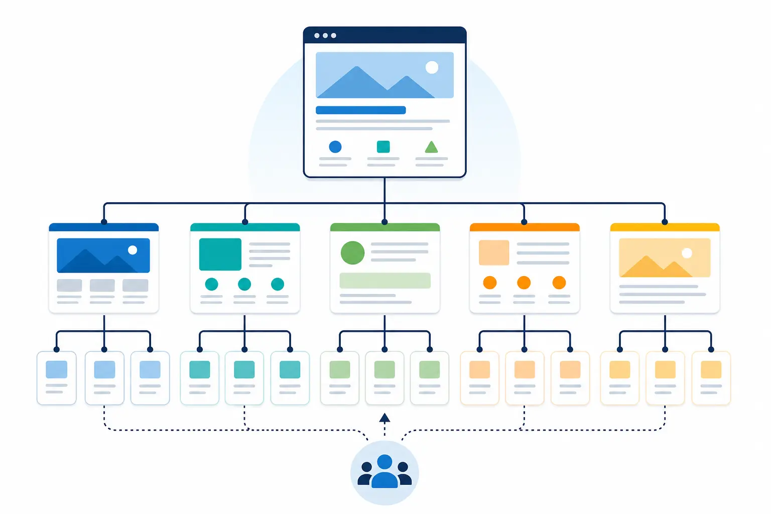
For most local service businesses, the cleanest setup is straightforward. One homepage for the brand and primary market. Separate pages for each core service. Location pages only where you have something specific to say. Trust pages for reviews, about, financing, warranties, or project examples. Then clear contact paths from all of them. You want navigation that feels easy to use, but you also need enough depth to support the services and areas you actually want to show up for.
A lot of websites miss this by stuffing every service and every city onto the homepage. It feels efficient. It usually weakens relevance. A page trying to rank for four service lines and six towns is rarely the best answer for any one search. On the other side, spinning up twenty near-copy location pages with only the town name changed creates its own problem if those pages add nothing useful.
Check your site like this:
Can a visitor reach each main service page in one or two clicks?
Do navigation labels say what you actually do, or do they hide it behind vague wording?
Does each location page include distinct local content, proof, photos, or work examples?
Are your priority pages linked from related pages, not just buried in a menu?
Can someone move from a service page to contact, estimate, or scheduling without hunting for it?
Internal linking does more work than many owners realize. Link related service pages, location pages, and trust pages into the pages you most want to rank and convert. That helps search engines understand your priorities, and it helps people keep moving instead of backing out. If a company is offering seo web design services, it should be able to explain this plainly before the build starts, not after launch when fixes get more expensive.
Speed affects trust before it affects rankings
Once the structure is right, speed gets practical fast. People do not experience your site as a technical score. They experience it as hesitation. A page hangs, the phone number does not show up, the form jumps around, and they leave.
For local service businesses, that usually happens on mobile first. Your prospective customer may be comparing providers between appointments, sitting in a truck, or trying to send a quick quote request before getting back to work. If your site takes too long to load because of oversized images, a bloated theme, autoplay video, too many popups, or plugins fighting each other, you can lose the lead before rankings have much chance to help.
We see owners chase page speed scores in the 90s while ignoring the obvious friction people actually feel. Start there:
Compress oversized homepage images
Remove scripts you do not use
Cut back autoplay video unless it clearly earns its spot
Be careful with chat tools, review widgets, trackers, and heavy animations
Some of those features do help conversion. Sometimes a chat tool is worth the extra weight. Sometimes strong visuals matter. But you should make those trade-offs on purpose, not because the template came packed with features you never asked for.
Good seo web design services do not treat speed like a lab exercise. They look at whether your key pages load cleanly, whether tap-to-call shows up right away, whether forms work without lag, and whether the site still feels solid after you add the marketing tools you actually need.
UX turns rankings into leads
Getting found is only half the job. Once someone lands on a service page from Google, they need quick confirmation that you do the work they need, in the area they need it, and that contacting you will be easy.
The basics should be obvious right away: a plain-English service headline, the city or service area, a phone number that is easy to tap, and a call to action that says what happens next. “Request a quote” is fine. “Let’s talk” is vague. Same with forms. If your form asks for ten fields on mobile, people leave. For most local businesses, name, contact info, service need, and a short message are enough to start.
Small UX misses cost leads. Hidden phone numbers in a sticky menu. Tiny text over a photo. A contact button that drops people onto a generic page. Navigation labels that make sense to your team but not to a customer in a hurry.
Trust matters close to the point of contact, not buried at the bottom. Put reassurance near the form or click-to-call button:
Clear service-area wording
Recent reviews
License or certification details where relevant
Before-and-after work, if your service is visual
Accessibility overlaps with UX in a practical way. Readable font sizes, decent contrast, labeled form fields, buttons large enough for thumbs. That does not guarantee higher rankings on its own. It does make your search traffic easier to use, which is what turns visits into calls, bookings, and quote requests.
How to choose the right web design partner
You are not just buying a nicer layout. You are trying to avoid a site that launches looking polished and then needs SEO repairs a month later.
Ask how the site is planned before design starts. If a company talks almost entirely about colors, layouts, and brand feel, but gets vague on page hierarchy, internal linking, mobile behavior, or what happens after launch, be careful. The same goes for anyone treating SEO like a later add-on. For most local businesses, that turns into weak service pages, messy rebuilds, and extra cost you did not budget for.
The reassuring signs are usually the practical ones. A sitemap. Planned service and location page structure. Wireframes that show content priority, not just visuals. Performance testing before launch. Clear notes on who owns the site, the content, the hosting setup, and who handles updates once the project is live.
How do you plan the sitemap and content hierarchy around my core services?
What do you check for page speed and mobile usability before launch?
How will navigation, internal links, and calls to action be handled on service pages?
Who owns the website files, content, and logins when the project is done?
Do you offer ongoing optimization, maintenance, and technical support after launch?
Seller's Bay has over 27 years of online marketing experience with clients worldwide. If you want a site that is built with search visibility, usability, and lead generation in mind from the start contact us today.
Frequently asked questions
What is SEO in web design?
It means building the site so search engines can understand it and people can use it without friction. On a local business site, that usually comes down to clear service pages, sensible navigation, internal links, fast mobile loading, and obvious paths to call or request a quote. A pretty layout doesn't help much when your main pages are buried, vague, or slow.
How much does an SEO service cost?
It depends on what you're buying. A one-time SEO review for a website rebuild is different from ongoing SEO work after launch. For this article, the bigger issue is scope. If a company says it does SEO web design services, ask whether site structure, page hierarchy, mobile usability, internal linking, and speed fixes are included, or if they're selling design first and calling the rest an add-on.
How much should I expect to pay for SEO?
Expect the price to follow the amount of work and how broken the foundation is. A local business with thin service pages, weak location pages, and a slow mobile site usually needs more than a few title tag edits. Cheap SEO often lands on top of a bad build and stalls there. Get clarity on what will actually be fixed before you compare quotes.
Is it worth paying for SEO services?
Usually, yes, if your site has real issues with structure, speed, and conversion paths. We've all seen websites that look finished but make it hard for Google to understand the services and hard for visitors to contact the business. Paying for SEO makes more sense when it improves the website itself, not just publishes a few blog posts while buried pages and weak mobile layouts stay untouched.
Do rankings improve just because a website gets redesigned?
No. A redesign can help, but only when it fixes the parts that were holding search back. Better page structure, clearer service and location pages, stronger internal linking, and faster mobile performance can improve how the site performs. A visual refresh by itself won't do much if the new build still hides key pages, loads slowly, or makes lead actions hard to find.
Our approach to web design services brings page structure, content and the customer journey together. For ongoing search support after launch, see our SEO services.
Your website can stay live, look acceptable at a glance, and still make it harder for local customers to contact you. That’s usually what pushes a redesign from a “someday” project into a real business decision.
Most redesign decisions are not about taste. They come down to trust, clarity, mobile usability, and how easily a visitor can take the next step. If you’re already comparing website redesign services for local businesses, there’s a good chance your site is doing less work than it should.
When an outdated site starts costing you business
You often notice this in lead quality before you notice it in the design. Calls feel less serious. Form submissions get vaguer. People visit a service page, then disappear. The homepage may still look “fine” to you, but first-time visitors judge it much faster.
They notice old photos, expired offers, reviews that stop two years ago, branding that doesn’t match your Google Business Profile, and forms that are annoying to use on a phone. That can affect any local service business, not just one type of company. An accounting firm, a med spa, a law office, a cleaning company, or a home service provider can all lose leads the same way if the mobile experience is slow and the next step is unclear.
Your traffic is steady, but inquiries are down or weaker than they were.
Mobile visitors leave quickly, especially from service pages.
You get more low-intent “just checking” leads and fewer ready-to-book contacts.
Trust signals look stale or inconsistent, including reviews, team photos, offers, and service area details.
You’re leaning harder on ads to make up for weak conversion paths on the site.
Not every slow stretch means you need a redesign. Seasonality, staffing changes, slower follow-up, or ad budget shifts can all affect lead flow. But if traffic holds up while conversions slide, or mobile visitors struggle more than desktop visitors, your site is a reasonable place to look.
And don’t judge everything by the homepage. Many visitors land on service pages, quote forms, location pages, financing pages, or review pages. Those are often the pages doing the real selling. That’s also where website redesign services can make a measurable difference if the structure or user flow is dated.
The signs a refresh is not enough
Some problems are fixable with targeted updates. Others sit deeper in the site.
A refresh usually handles surface issues. New photos, cleaner typography, better spacing, updated colors, trimmed copy. Sometimes that’s enough.
A rebuild is different. You need one when the site structure, templates, platform, or content hierarchy keep getting in the way.
Use the contrast below to separate the two.
Refresh-level issue: your contact form is too long on mobile. Rebuild-level issue: the whole conversion path is buried across multiple pages and the template gives you no clean way to fix it.
Refresh-level issue: photos and copy feel dated. Rebuild-level issue: visitors still can’t tell what you offer, where you work, or how to contact you within a few seconds.
Refresh-level issue: one service page underperforms. Rebuild-level issue: navigation is cluttered, services overlap, and users have to dig through the whole site.
Refresh-level issue: one plugin or form tool is causing trouble. Rebuild-level issue: the platform breaks easily, limits changes, or makes routine updates expensive.
Refresh-level issue: speed is poor on a few heavy pages. Rebuild-level issue: the site has been patched repeatedly and technical debt keeps blocking basic improvements.
A visual makeover won’t solve structural confusion. If visitors can’t tell where to click, what you actually do, or why they should trust you, nicer colors and better buttons won’t change much.
Still, there’s no reason to force a full rebuild when one path is clearly broken. If one form failed, one landing page is weak, or one traffic source changed, fix that first. Website redesign services make the most sense when the problem runs through the site, not when a single page needs repair.
What a redesign should improve for a local service business
You’re not paying for a prettier homepage. You’re paying for a site that helps more people contact you without friction.
That usually means clearer messaging, simpler navigation, stronger mobile usability, and calls to action that show up where people need them. More calls, better quote requests, and fewer abandoned visits are the goals. The design only matters if it supports those outcomes.
Trust has to show up early. Service areas. Current reviews. Certifications or license details when they matter in your field. Real photos. A visible phone number. A clear process. If those details are buried or inconsistent, the page has work to do.
If a redesign does not make those answers easier to find, it’s mostly cosmetic.
The technical side matters for the same reason. Speed affects drop-off. Accessibility affects whether people can use the site at all. Clean structure affects how easily someone scans a page on a phone. Strong website redesign services should improve the visual side and leave you with a site that is easier to maintain after launch.
A simple way to decide if now is the right time
Use a quick scorecard. Pull up your phone, look at your recent leads, and think through any complaints you’ve heard from customers or staff.
Business impact: Are calls, form fills, or booked jobs down, or just uneven? If weaker lead quality keeps showing up month after month, score that high.
User friction: On mobile, can someone find services, service areas, trust signals, and the contact button quickly? If they have to pinch, hunt, or guess, that’s not minor.
Technical limits: Is the site hard to update, slow, broken in spots, or stuck on a platform that fights every change? That often pushes you beyond a simple refresh.
What’s next for the business: New services, a rebrand, online payments, multiple locations, better booking, or more landing pages all change the timing.
If one area scores high, start with focused fixes. Two high scores may point to a structured refresh. Three or four, especially with technical limits in the mix, often put you in redesign territory.
Timing still matters. Launching right before a busy season may help if your current site is leaking leads. Launching during your busiest month, with no time for content review or form testing, can create avoidable problems.
Budget hesitation is normal. Sometimes staged improvements are the better move. But it helps to compare that option against another six months of weak mobile usability, slow updates, or lower-quality inquiries. In many cases, delaying the work creates its own costs, just less visibly. If traffic is steady, leads are still decent, and the main problem is visual age, gradual improvement may be enough for now.
How to choose website redesign services with confidence
Once you believe the site is part of the problem, the next mistake is choosing a provider based only on mockups or the lowest number.
You want a partner who can explain how they think. For a local service business, that means asking about lead quality, service areas, your highest-value services, who handles incoming calls, which pages already attract traffic, and what needs to carry over during the redesign. If the conversation jumps straight to colors and homepage style, slow the process down.
Before you ask for a proposal, ask a few plain questions:
How do you handle discovery before design starts?
What do you do to preserve rankings, URLs, and existing SEO value during launch?
Who handles content migration, and what happens if current pages are thin, outdated, or duplicated?
What does the timeline depend on, and what can delay it?
What support do we get after launch if forms break, traffic dips, or staff needs help updating content?
The proposal should answer those same issues clearly. You should be able to see the goals, the scope, who is responsible for what, and what is excluded. Be careful with vague promises, “custom” plans that are mostly template swaps, or any process that treats migration like a simple copy-and-paste job.
Compare providers on fit, process, and whether they understand local lead generation, site structure, and ongoing maintenance. If you’re ready to explore professional website redesign services, start with a team that can review how your current site supports leads, where it creates friction, and whether a refresh or a full rebuild makes more sense for your business.
Frequently asked questions
How much should a website redesign cost?
It depends on how deep the problem goes. A true redesign usually costs more than a visual refresh because you’re changing structure, templates, content flow, and mobile usability, not just swapping colors and photos. For a local service business, judge the quote by what’s being fixed. If your traffic is steady but conversions are slipping, a cheaper cosmetic update may just delay the real work.
How much does it cost to have someone update a website?
Simple updates are usually the cheaper route. Think new photos, cleaner copy, shorter forms, updated reviews, or fixing one weak page. That makes sense when the issue is isolated. But if navigation is cluttered, service pages overlap, or routine edits are painful because the platform fights you, paying for piecemeal updates can add up fast without improving lead flow.
Can AI redesign my existing website?
AI can help with pieces of a redesign, especially first-draft copy, layout ideas, or content cleanup. It can’t decide the hard part on its own: what’s actually blocking local leads on your site. That takes judgment. You still need someone to sort out service hierarchy, mobile conversion paths, trust signals, and the pages people land on before they call or fill out a form.
How much does it cost to pay someone to design a website?
Design pricing varies a lot because “design a website” can mean anything from a homepage mockup to a full rebuild with content planning and technical cleanup. For this kind of project, I’d worry less about the artwork and more about what the site will improve. You’re paying for clearer next steps, stronger mobile use, and a site your team can actually maintain after launch.
Should I update my website or redesign it?
Start with the problem, not the visuals. Update the site if one form is broken, copy feels old, or a handful of pages need cleanup. Redesign it if the issue runs through the whole site: visitors can’t tell what you do fast enough, navigation sends people in circles, mobile users drop off, or the platform makes basic fixes harder than they should be.
If a redesign is the right next step, explore our web design services. For a functioning site with a weak enquiry journey, consider our Conversion Rate Optimization Services.