
SELLER’S BAY · SINCE 1998
Responsive Website Design
Make your website easier to use on phones, tablets and desktops with a design that adapts to your visitors.




SELECTED RECOGNITION · 2024
Recognized for the work we do.






ONE WEBSITE. DIFFERENT SCREENS.
Make every visit easier to navigate.
What is a responsive website?
Responsive website design adapts the layout of a page to the available screen space. Text, images, navigation and columns adjust so the same website can be used on phones, tablets and desktops.
Seller’s Bay designs around the tasks visitors need to complete, from reading about a service to sending an inquiry or buying a product. We look at the experience across screen sizes rather than simply shrinking a desktop layout.
Explore our broader web design services for a new website or a complete redesign.
WHAT WE IMPROVE
Good design holds together at every size.
01
Flexible layouts
Adapt columns, spacing and content order to the screen. Keep important information available as the layout changes.
02
Readable typography
Use responsive type sizes and comfortable line lengths. Give headings, paragraphs and supporting details a clear hierarchy.
03
Usable navigation
Make menus, links and controls easy to reach. Review touch interactions, keyboard access and the routes to important pages.
04
Forms & calls to action
Give fields useful labels, allow space for input and make the next step clear. Check validation and form layouts on smaller screens.
05
Images & loading performance
Choose suitable image sizes and review media that adds unnecessary weight. Responsive layout and loading performance need attention together.
06
Shopping & interactive content
Check galleries, product options, tables and checkout journeys at different widths. Our eCommerce design services connect these details for online stores.
WHY RESPONSIVE DESIGN MATTERS
A more consistent experience for your audience.
Your visitors may arrive from search, a shared link or a returning visit on another device. A responsive website helps keep the content and brand experience connected.
One set of pages to maintain
Responsive pages use the same URLs across devices. This can simplify publishing and link sharing compared with maintaining separate mobile pages.
A clearer route to action
Readable content and usable forms can remove obstacles to inquiries and purchases. Improvements should be measured against actual visitor behavior, not a promised conversion increase.
Consistent presentation
A coherent design helps visitors recognize your business across devices. Useful navigation and content support engagement without assuming everyone browses in the same way.
More useful measurement
Review behavior by device within your measurement setup. Compare important journeys and outcomes to find where visitors encounter problems; one URL does not automatically make analytics accurate.
RESPONSIVE DESIGN & SEO
Keep your mobile content complete and accessible.
Google uses the mobile version of content for indexing and ranking. Responsive design serves the same HTML and URL across devices, adapting the presentation to the screen.
We review important content, headings, internal links and media so the mobile experience remains useful. Responsive design alone does not guarantee higher rankings; it belongs within a wider SEO strategy.
If an older site uses separate mobile URLs, any consolidation needs a URL and redirect plan. A mobile-friendly site does not require a separate domain.
SELECTED PROJECTS
Websites built around real businesses.
Explore our work. Select a project to take a closer look.
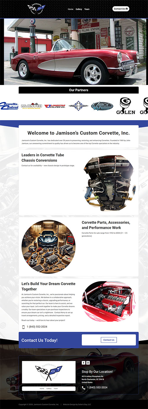
Jamison Custom Corvette

Filtrabox
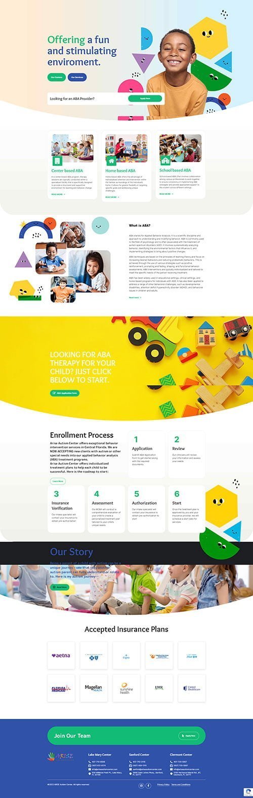
Arise Autism Center
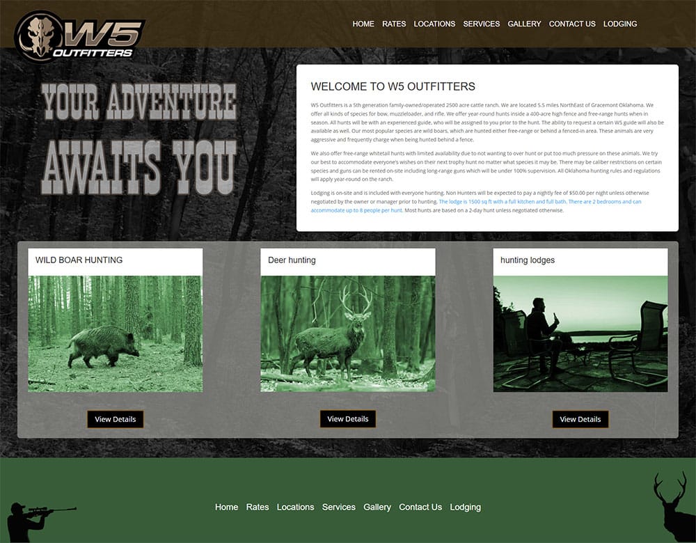
W5 Outfitters
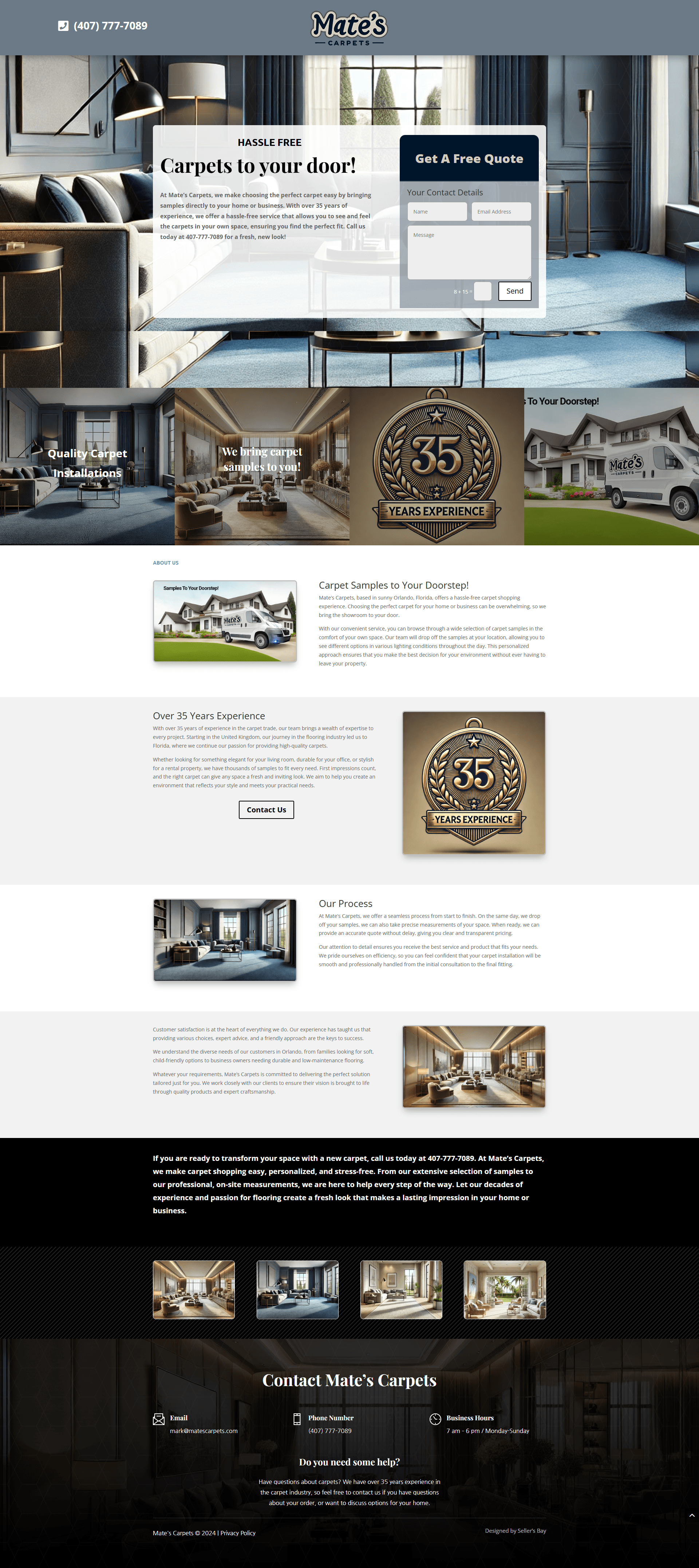
Mates Carpets
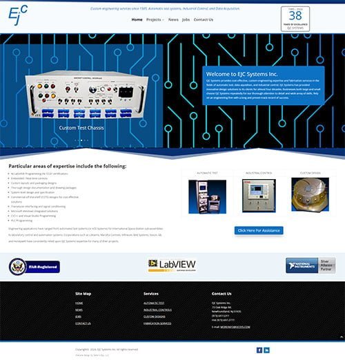
EJC Systems

Commercial Mechanical

TRC
OUR PROCESS
Design, test and refine the experience.
STEP 01
Review real journeys
Identify important pages and tasks, then inspect how the current website behaves at different widths.
STEP 02
Plan the layouts
Decide how content, navigation and controls should adapt. Preserve useful information and keep the next action visible.
STEP 03
Build & check
Implement the agreed changes and check representative desktop, tablet and phone sizes, including key forms and interactions.
STEP 04
Refine over time
Use feedback and available performance data to prioritize improvements. Continue checking layouts as content and features change.
CLIENT EXPERIENCES
What our clients say
Real feedback on our web design, development and ongoing support.
“We’re so satisfied with Seller’s Bay, LLC’s work that we contracted them again for SEO.”
President
Pat Technology Systems Inc
“Their customer service and the quality of their product were most impressive.”
Artist
TwoAvocadosSigns
“Great company to work with Step by step instructions to get your website / email and business needs up and running highly recommended”
Louisa Richardson
Google reviewer
CONNECTED WEBSITE SUPPORT
Choose the right foundation for ongoing updates.
Explore our WordPress website design and Divi design services for an editable website.
After launch, website management and maintenance packages can support routine changes and checks. View all our digital marketing services →
Responsive layouts are part of our web design services. For the next step, explore Conversion Rate Optimization Services or read improving the website user experience.
YOUR QUESTIONS, ANSWERED
Responsive website design FAQs
Do I need a separate domain for mobile visitors?
No. Responsive design uses the same page URL across devices. Other mobile configurations also exist, but a separate domain is not required to make a website mobile-friendly.
Can you improve my existing website?
Yes. We review the current theme, layout and functionality first. Some sites need targeted corrections; others benefit from a broader redesign.
Does responsive design automatically make a website fast?
No. Layout is one part of the experience. Images, scripts, hosting and implementation also affect loading performance and need separate review.
Will a responsive website improve rankings or sales?
Better usability can remove obstacles, but responsive design does not guarantee a ranking or conversion result. We review the website alongside content, search strategy and actual business outcomes.
Will important content disappear on mobile?
The goal is to preserve useful content and functions while changing the presentation. We may stack columns or reorganize sections, rather than removing information simply to fit the screen.
Can responsive design work with WordPress or Divi?
Yes. We can plan responsive layouts with WordPress and visual builders such as Divi. The chosen theme and modules still need appropriate configuration and testing.
Is one responsive website cheaper to maintain?
One set of pages can reduce duplicate publishing and development work compared with separate sites. Actual costs depend on the platform, functionality and required support.
Does responsive design eliminate future maintenance?
No. New content, browsers, devices and features can create new issues. Regular checks and maintenance help keep the experience useful over time.
LET’S IMPROVE YOUR MOBILE EXPERIENCE
Tell us where your website falls short.
Share your website and the pages or interactions that need attention. Mention whether you need a new design or improvements to an existing site.
We’ll review the starting point and discuss a practical next step.
Tell us what you need help with.
Share your website and the tasks you’d like support with.