
Summary
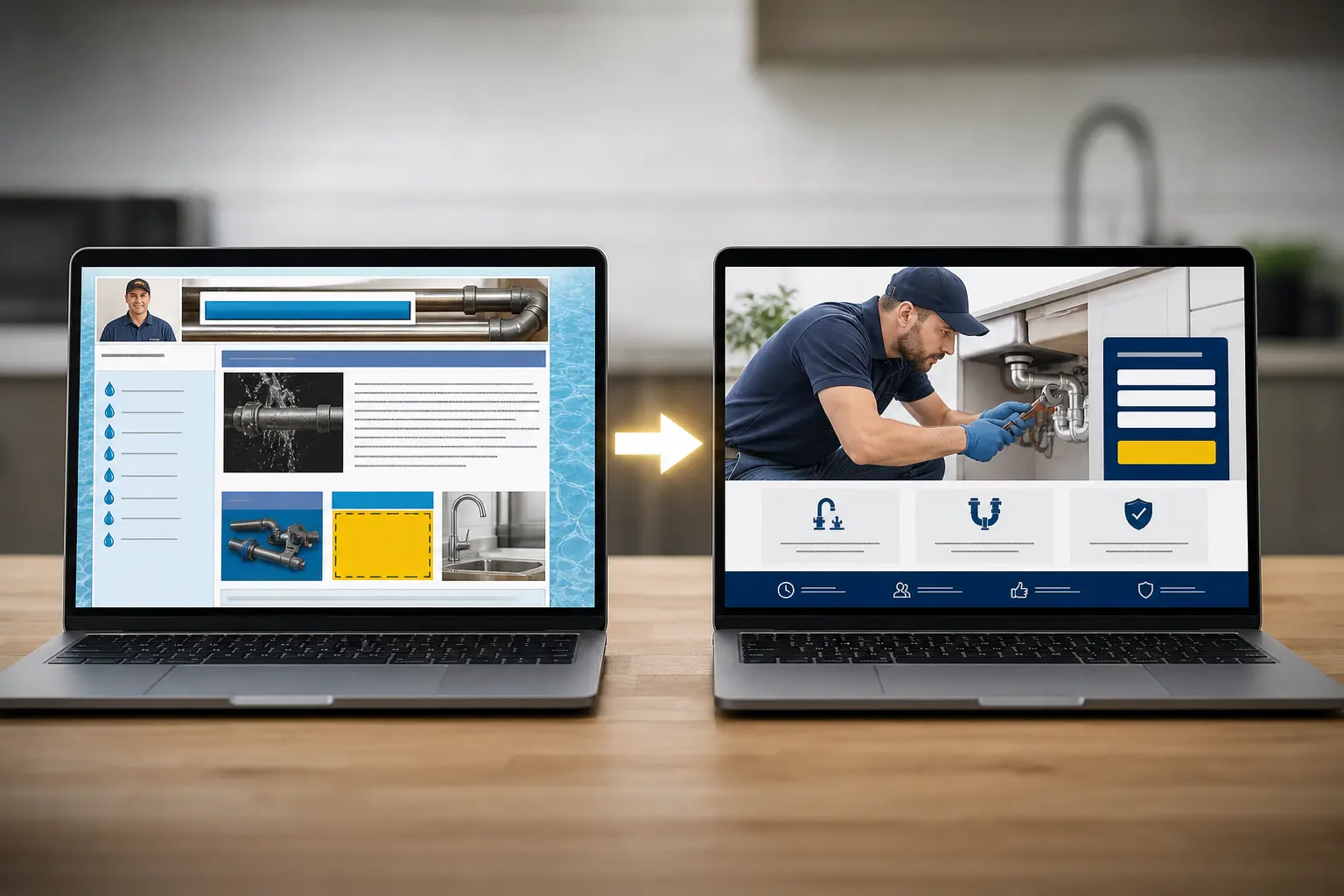
Your website may not look broken, but it can still quietly cost you calls with slow pages, clumsy mobile layouts, buried contact info, thin service pages, or forms people abandon halfway through. The piece walks through 15 common warning signs, plus how to tell whether you need simple maintenance, a visual refresh, or a full redesign before you keep spending rebuild money in slow motion.
If you're paying for ads, asking for reviews, and sending people to your site, that site should be helping you win work. Too often it does the opposite. Ready-to-book visitors land there, hesitate, miss the phone number, give up on the form, or decide your business feels harder to trust than the next local service business they check.
An old website doesn't have to look terrible to hurt you. Sometimes the problem is speed. Sometimes it's a broken mobile layout, thin service pages, or a contact process with one extra step too many. At Seller's Bay, we've spent more than 27 years helping businesses improve their online marketing, websites, and lead flow. In a lot of redesign conversations, the issue isn't one dramatic failure. It's a stack of smaller problems that keep costing you calls and quote requests until patching the site stops making sense.
What a redesign should actually fix
Before you decide you need a full small business website redesign, pin down what's actually broken. Low leads are not always a design problem. Sometimes the traffic is weak, the offer is vague, or nobody follows up on quote requests fast enough. Your site still matters a lot, but judge it by business outcomes: booked calls, estimate requests, and whether the leads coming in are the kind of local jobs you want.
For most local service business sites, the job is pretty simple. Build trust fast. Make the service clear. Remove the little bits of friction that make people stall out. Fancy effects usually don't help. Better page structure, stronger calls to action, clearer service pages, faster load times, and cleaner mobile layouts usually do.
- Choose maintenance if the site basically works and you mainly need updates, speed work, security, form checks, and content edits. That's often enough when leads are steady but the site is getting neglected.
- Choose a visual refresh if the branding looks dated but the structure, pages, and conversion paths still make sense.
- Choose a structural redesign if visitors can't find services, calls to action are buried, mobile use feels clumsy, or your content no longer matches how people search.
- Choose a rebuild if the platform is fragile, hard to update, full of plugin issues, or every change turns into a workaround.
- Check marketing first if traffic is unqualified or too thin. A prettier site won't fix bad targeting.
And yes, patching an old site can be cheaper for a while. But if you're paying again and again to fix forms, layout breaks, plugin conflicts, and weird mobile issues, you may be spending rebuild money in slow motion. At that point, design, SEO, content, and conversion work usually need to be planned together instead of patched one ticket at a time. If your main issue is upkeep, ongoing website management support may buy you time without pushing you into a full rebuild yet.
The 15 signs your site is losing business
You usually don't need fancy reporting to spot a website problem. You see it in the day-to-day stuff. People say they couldn't find the form. Referral traffic doesn't turn into calls. The site technically works, but you feel a little reluctant to send prospects there.
Look at these signs in groups, because they tend to pile up. One issue can be manageable. Four or five together usually means your website is dragging on sales.
Usability signs
- Your site is frustrating on a phone. Buttons are hard to tap, text is tiny, popups cover the screen, or key info gets buried below oversized images.
- Pages load slowly enough that you notice it yourself. If you feel the delay on decent internet, impatient visitors feel it too.
- Your navigation makes sense to you, not to first-time visitors. Services are tucked under vague menu labels, or people have to click around too much to figure out what you do.
- Important service pages are thin, vague, or repetitive. If multiple pages say nearly the same thing, visitors don't get a clear reason to contact you.
- Your phone number, hours, service area, or booking link aren't obvious right away. People shouldn't have to hunt for the basics.
- Your contact or quote forms ask for too much too soon. Long forms can make sense for some jobs, but asking for every project detail on first contact often kills response.
Trust signs
- The design looks dated next to local competitors. That doesn't mean you need trend-heavy design. It means the site feels neglected, even if your actual business is solid.
- Your branding is inconsistent. The site doesn't match your trucks, office, ads, or Google Business Profile, so the business feels less established than it is.
- Reviews, certifications, warranties, financing, or before-and-after proof are missing or hard to find. People want reasons to trust you without making a phone call first.
- Some pages look broken, old, or half-finished. Outdated promotions, missing images, layout glitches, and old staff pages quietly damage credibility.
- You avoid sending people to certain pages. If you already know a page doesn't help the sale, your visitors probably feel that too.
Conversion signs
- Traffic is decent, but calls and form fills stay flat. People are arriving, but the site isn't doing enough to convert them.
- Referral visitors still text or call with basic questions the site should answer. If someone was sent to your website and still asks what areas you serve or how to book, the page didn't do its job.
- The leads you get are a poor fit. Wrong service, wrong location, low intent, or confusion about what you actually offer usually points to weak page structure or messaging.
- People start a form or booking request, then disappear. That drop-off can come from clunky layout, too many fields, or weak trust signals at the point of action.
An HVAC company might get steady search traffic and still lose mobile visitors if the phone number isn't easy to tap, financing details are buried, and the estimate form feels like paperwork. A plumbing company can have the same problem once the site grows messy from years of small edits. Those are common service-business issues, not unusual edge cases.

Which problems hurt service businesses most
Some website issues are annoying. A few are expensive. For a local service business, the biggest losses usually come from three places: people can't tell exactly what you do, they don't see enough proof to trust you, or the contact path gets awkward right when they're ready to act.
Your buyer is not studying ten companies for a week. A lot of them compare two or three sites, make a quick judgment, and move on. So the first screen has to do some basic work fast: what services you offer, where you offer them, how soon you respond, and how someone can reach you right now.
Owners miss this because they copy big-brand design trends. Full-width video. Tiny text. Abstract headlines. Hidden menus. Meanwhile, the useful stuff gets buried: service areas, license info, reviews, before-and-after work, phone number, booking, hours.
Mobile matters more here than it does for a lot of other businesses. Somebody searching from a parking lot or between appointments is not going to pinch-zoom through a slow homepage to find your number. If your site loads heavy, the tap targets are cramped, or the quote form feels like a chore, call-driven leads leak out fast.
And a polished homepage can still underperform if the content structure is weak. Clear service pages, location cues, and plain headings help people and search engines understand what you do and where you do it. If your site barely mentions your service area, nearby towns, or the actual jobs you want, you can look less useful to local customers than a competitor with a less fancy design and clearer pages.
A simple redesign decision framework
If you're trying to decide between more patching and a full rebuild, use a short scorecard.
- Lead quality: are the people contacting you asking for the work you actually want, or are they confused before they even call?
- Mobile experience: can someone on a phone understand your services, trust you, and contact you in under a minute?
- Easy updates: can you add a new service, new city, financing option, or seasonal offer without emailing a developer every time?
- Credibility: does the site still match the level of business you run now, or does it feel like you haven't touched it in years?
- Service-page fit: do your main pages reflect what you sell today, not what you sold three years ago?
Rate each one: good, shaky, or bad.
If three or more are bad, you're probably in small business website redesign territory. If one or two are shaky but leads still come in and close well, phase the work. Fix the contact path, rewrite the core pages, clean up mobile, then decide if the full rebuild is still needed.
A plumbing business is a good example. The old site may still function, but once you add emergency service, financing, and multiple suburbs, selective edits start turning into workarounds. That's often the tipping point.
One thing to avoid: redesigning because you're tired of the look. Before you talk to agencies or freelancers, write down what the site needs to do now. More booked calls. Better quote requests. Support for new services. Fewer dead-end pages. If those goals aren't clear, the project gets expensive fast.
How to plan a redesign that pays off
Don't start with colors. Start with decisions. A small business website redesign usually goes sideways because nobody locked down the basics first: which services matter most, which towns or service areas you actually want more work from, and what you want visitors to do on each page.
Call. Request an estimate. Book. Upload project details. Pick the main action before design starts, not after the mockup looks nice.
Get your inputs together early. That means the pages you actually need, your current service descriptions, reviews you're allowed to use, real job photos, certifications, licenses, financing info if it matters, and a clean list of service areas. For a local service business, those details do more work than decorative copy. They help with trust, and they help search visibility.
One thing owners miss all the time is preserving what already works. Maybe an old service page ranks well. Maybe one short form gets better leads than your long contact page. Don't wipe that stuff out by accident. Before launch, make sure someone maps redirects, keeps important URLs where possible, installs tracking, and checks phone clicks, forms, and thank-you pages so you can tell what the redesign changed.
Speed matters, yes. But rushing a launch with weak messaging, missing proof, and no tracking usually costs more than waiting another week or two. And launch day is not the finish line. Plan for edits, testing, plugin updates, content changes, and somebody owning the site after it goes live. Otherwise you end up with a newer version of the same problem.
Choosing the right redesign partner
Once you've got a scorecard and a pretty honest list of what your site is getting wrong, the next job is picking someone who can fix the whole chain, not just make it look newer. For a local service business, that usually means design, development, conversion thinking, content handling, maintenance, and at least some marketing sense all have to connect. If the provider only talks about mockups, you're missing half the project.
Ask blunt questions. How do you handle content migration? What happens to existing rankings and service pages? Who writes or rewrites page copy if the current wording is weak? What's the timeline, and what usually causes it to slip? After launch, do they disappear, or do they help with fixes, updates, forms, tracking, and the small issues that always show up in the first few weeks?
Some red flags are easy to spot:
- Scope is vague, but the sales pitch sounds confident.
- Everything is a template, even though your business has specific services, service areas, and lead goals.
- There's no plan for preserving content, redirects, forms, reviews, or SEO basics.
- There's no post-launch support unless you start a separate project from scratch.
Seller's Bay brings more than 27 years of online marketing experience to this kind of work, so we tend to look at redesigns the way owners do: not as a style project, but as a lead and sales problem that needs a practical fix.
If your site is showing several of these warning signs, it's worth getting a professional review before you keep patching it. You can start here: webdesignservices.net.
Frequently asked questions
How much should a website redesign cost?
It depends on what you’re actually fixing. A small business website redesign costs a lot less when the structure still works and you mainly need cleaner layouts, stronger calls to action, and better mobile behavior. The price climbs fast when the platform is fragile, pages need rewriting, forms keep breaking, or SEO, design, and conversion work all need to be rebuilt together. Get the scope right before you compare quotes.
How much will it cost to redesign a website in 2026?
2026 pricing will still hinge on scope more than the calendar. A light refresh is one thing. A full rebuild with new service pages, local SEO planning, speed work, better navigation, and conversion fixes is another. For most small businesses, the expensive mistake is paying for repeated patch jobs on an old site without deciding whether you need maintenance, a refresh, or a true structural redesign.
Can AI redesign my existing website?
AI can help with pieces of the job. It can speed up wireframes, rewrite rough copy, suggest layouts, and flag thin pages. But it won’t reliably sort out your real conversion problems on its own, especially when the issue is buried contact info, confusing service paths, weak trust signals, or a clumsy mobile experience. You still need human judgment to decide what stays, what gets rebuilt, and what actually helps people book.
What are some good website designs for small businesses?
Good small business website design is usually pretty plain in the best way. Clear service pages, obvious phone and contact options, fast load times, clean mobile layouts, and trust signals people can find without digging. Fancy motion effects rarely help a local service company win more calls. A site that answers basic questions fast and makes the next step feel easy usually beats one that looks more “designed.”
How do I know if I need a full redesign or just website maintenance?
Start with what’s breaking sales. Choose maintenance when the site mostly works and you need updates, security, speed improvements, form checks, and content edits. Go with a visual refresh if it looks dated but the structure still makes sense. You’re in redesign territory when navigation is confusing, mobile use is clumsy, calls to action are buried, or every fix turns into another workaround.
When the issues call for a rebuild, explore our web design services. If the site works but visitors struggle to take the next step, our Conversion Rate Optimization Services focuses on that conversion path.
For a practical next step, read Website Redesign Services: 9 Signs Your Site Is Holding Back Local Leads and Tips For Improving Your Website User Experience.

0 Comments